- Your online presence is one of your most important sales efforts. Don’t neglect it.
- Get a simple site domain.
- Keep the site design simple and clean.
- Be sure your site is easy to navigate.
- Tell visitors what you do with a clear overview of your business.
- Make it extremely easy for visitors to contact you.
- Showcase testimonials front and center.
- Give people the photos they’re coming for.
- Regularly create and share quality and focused content.
- Proofread every word on your site
- Drop in local references
- Enforce national-level practices
Your online presence is one of your most important sales efforts. Don’t neglect it.
Whether a potential client heard about you through your own lead generation efforts or, better yet, you got referred by one of your own clients, your site is one of the first interactions that person will have with you. Obviously, you want that interaction, that experience, to be easy, simple, informative, and exciting.
The best way to ensure your site gives visitors as close to that as possible, follow our simple guide to the top website considerations any contractor or home improvement company should prioritize. To be sure, we sprinkled in some examples from Modernize clients that do websites right to give you an example of what we’re talking about.
Get a simple site domain.
Hopefully, your company site URL can be your company name followed by a “.com.” For example, modernize.com tells people everything they need to know about how to reach us if they hear about us anywhere. Even if a person didn’t catch our exact URL, they will find it easy to find us either by trying to get to modernize.com since that’s intuitive or they will find us through Google, where our name is short and simple enough to make a search easy.
For example, roofing company Roofing Right Now is at roofrightnow.com, HVAC company Parker and Sons is at parkerandsons.com, and solar company Horizon Solar Power is at horizonsolarpower.com.
Keep the site design simple and clean.
Chances are that your site visitors are under some sort of stress, whether seeking emergency repairs or trying not to dip too much into their savings for a dream home improvement.
Fight the urge to complicate your site with unnecessary elements and text. Keep things clear, let everything breathe, and ensure visiting your site is a calming and assuring experience. While you want to include all the components a contractor wants in their site (which we’ll get to shortly), they don’t all have to appear above the fold on the first page a visitor lands on.

Be sure your site is easy to navigate.
Building on the simplicity we mentioned above, make it easy for any site visitor to get what they want from your site. And in this sense, easy means simple and clear — whether using words or images, any visitor should be able to find what they’re looking without getting a headache.
The Parker & Sons site we mentioned above gives us a good example of easy navigation.
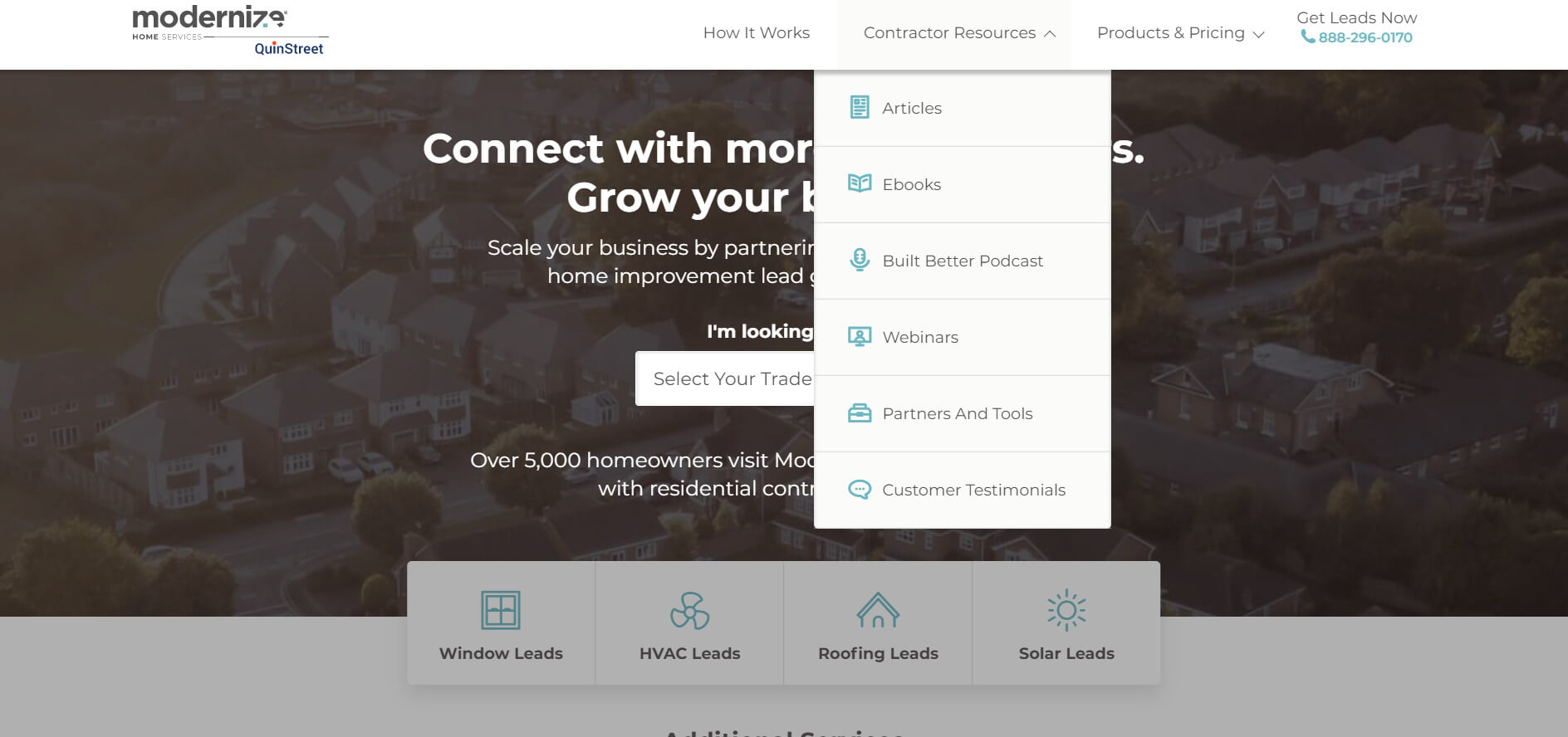
Notice that not only is each of the site’s sections listed in a navigation bar at the top of the page, but broad sections like Services offer a quick and interactive guide to each service the company offers, making it easy to click through to the exact service a visitor is looking for.
Tell visitors what you do with a clear overview of your business.
Whatever it is you’re offering potential clientele—whether solar, roofing, windows, HVAC, or otherwise—be clear about it upfront. Don’t make a site visitor work too hard to find out what you’re about and whether they might be interested in your services.
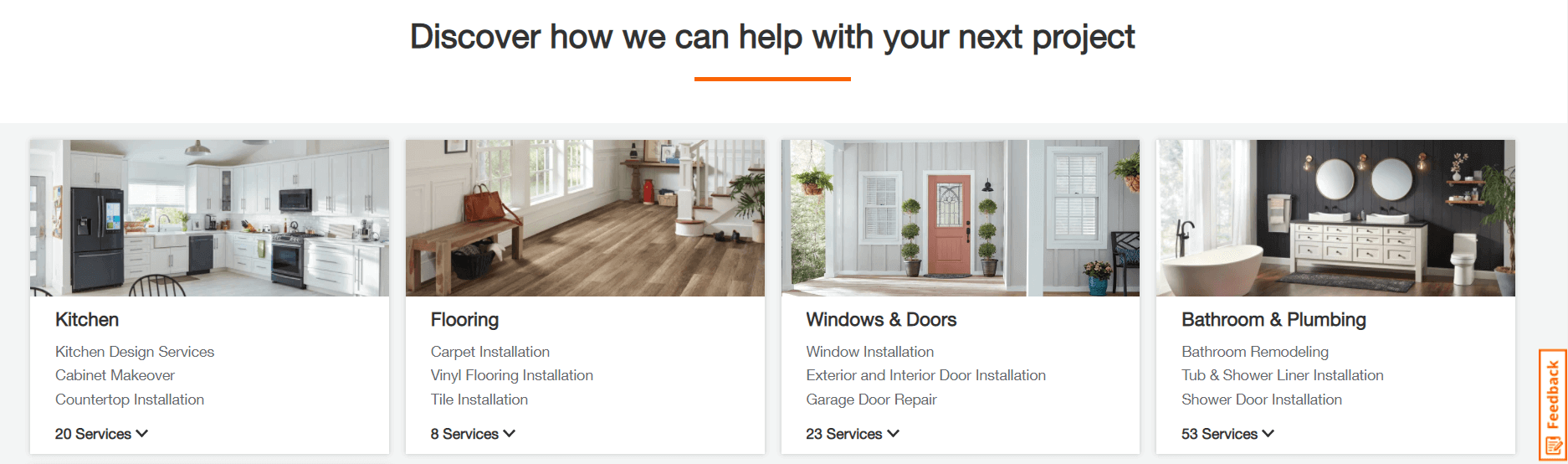
At the bottom of the top portion (in other, above the fold) the Sears Home Services site clearly lays out each of the services you can find through its site, broken down into categories (Repair, Home Improvement, Clean & Maintain) that each go a step further and offer a “view all…” to tell visitors there’s even more Sears can do for them.
Of course, there’s more context to these services but that doesn’t matter at this point of a visitor’s journey through their site.
Make it extremely easy for visitors to contact you.
If everything goes well and a visitor is ready to get in touch and request an estimate or ask you a question about a more nuanced service they might need, make it easy for them to do so.
At the aforementioned Sears site, there’s a prominent Schedule Now Button at the top left of the page, followed a phone number to call, not to mention the “Chat” button at the top menu of the site (and in a sticky button at the bottom right of the page). All else aside, I at least know how to get in touch with Sears quickly and easily.
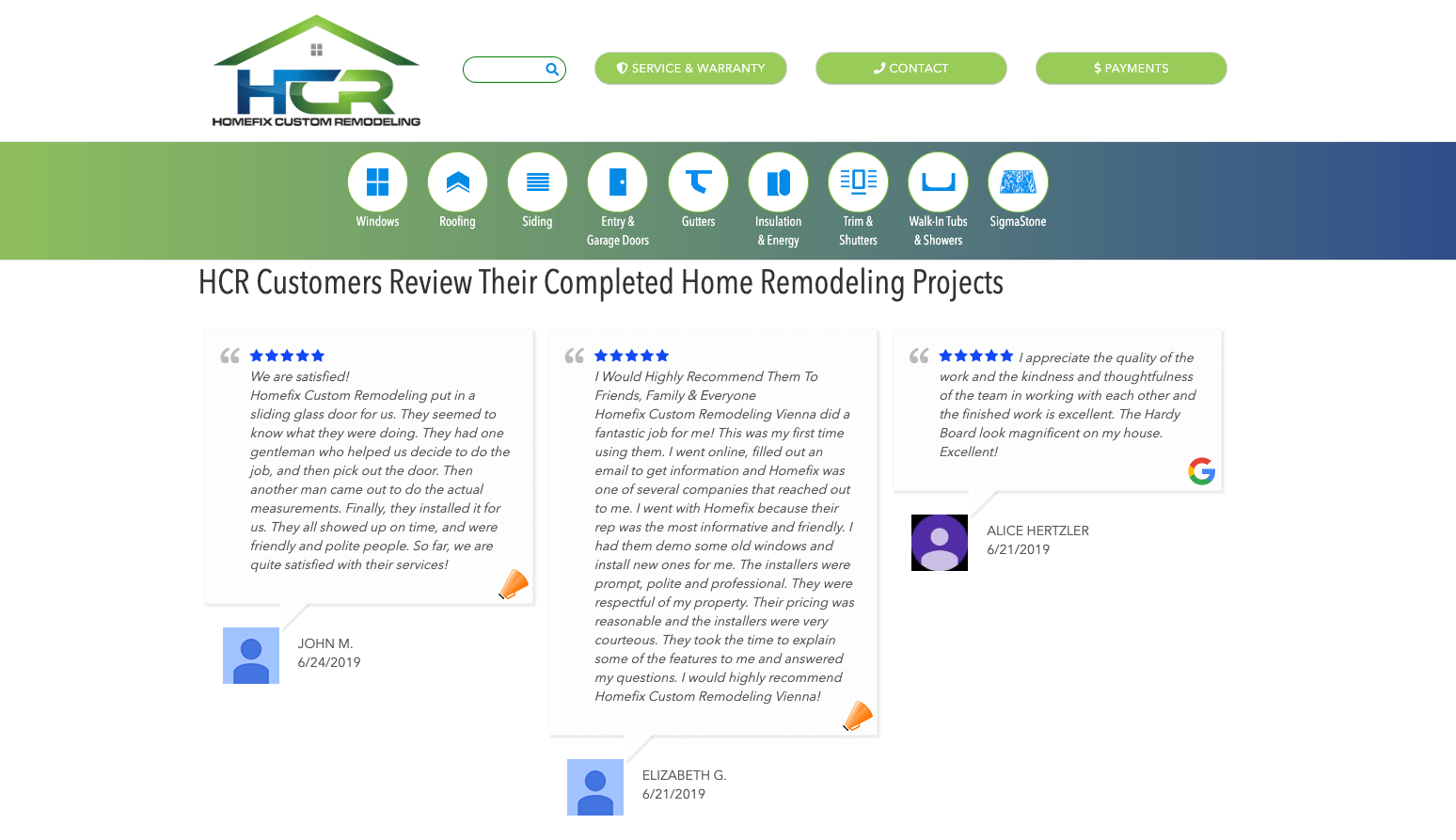
Showcase testimonials front and center.
While it’s a pretty big deal to have a person get to your site in the first place, your work in getting them to trust you for work on their home has only just begun.
Showing them that other people not only hired you and worked with you, but also found the work commendable enough to review and note online is crucial in guaranteeing they trust your work and your standing.
At Homefix Custom Remodeling, as you can see in the example below, you get an endless feed of customer reviews, aggregated from both Google and CustomerLobby, each review including a real person’s name and review date so that the site visitor knows how recent this positive feedback came.
Give people the photos they’re coming for.
The visual medium is one of the strongest ways to show someone what your work looks like. Beyond your own promises and guarantees, promotions and discounts, and testimonials from previous clients, an image of a completed project says quite a lot.
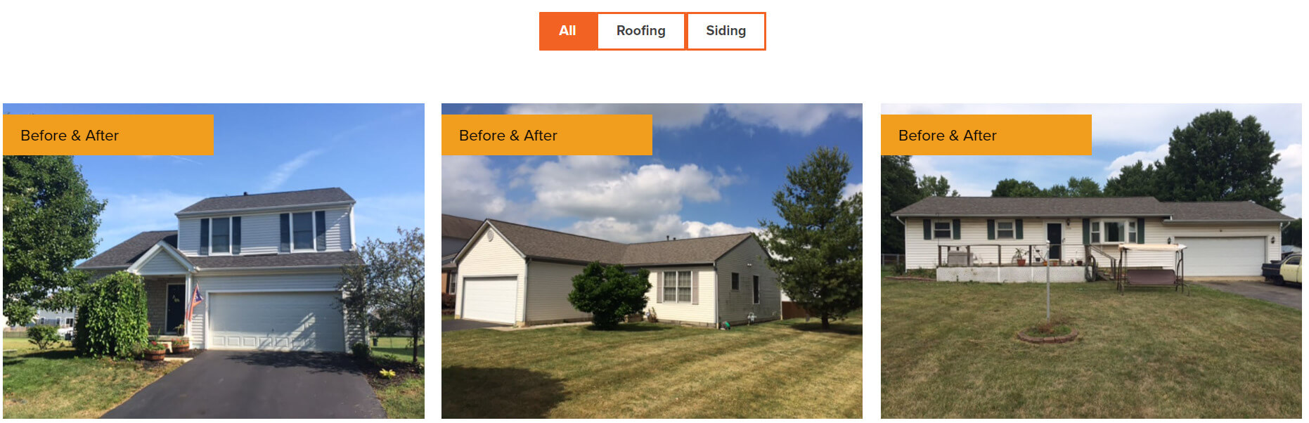
In a clearly marked section of Mr. Roof’s site, you’ll find the Gallery. It’s full of photos like the one above, showing you clearly before and after images of the company’s work. Not only are hopeful clients getting a glimpse into the type of homes you work on and what completed projects end up looking like, they also see that you are proud of the work you’ve put forth and how many successful projects you’re willing to share.
An experienced contractor openly shares their previous work and a gallery of your work accomplished just that.
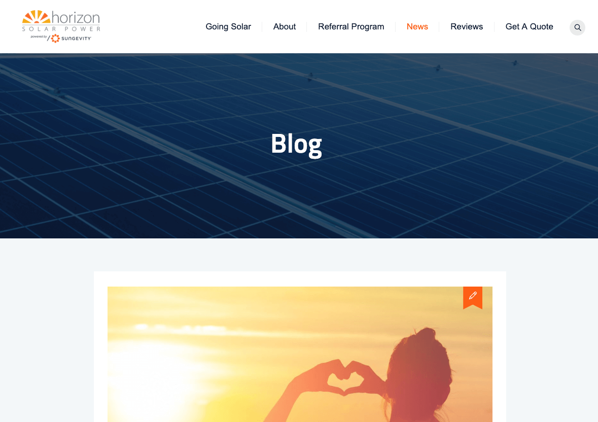
Regularly create and share quality and focused content.
Whether you decide to go with a blog like Horizon Solar Power or embed social media accounts like your Instagram or Facebook feeds into a page, be sure you have new information coming into your site on a regular basis.
Clients will expect you not only to exist online but also to be active online — regularly. Blog posts or the captions you place beneath new photos don’t need to take you longer than a few minutes. Give the site visitor some context on what they’re looking and add flavor as you see fit, maybe mentioning what stood out to you about this project or why you think it’s different than the others. Whatever you do, do it at least once a week.
Proofread every word on your site
Typos look unprofessional. No matter what—and you can likely relate to this—catching something wrong in a site’s text leaves a bad taste in your mouth and at least leads you to question their commitment to their image.
Just imagine you’re reading through this blog of ours and we write something like It’s 2019 and w’ere readdy for new prjcts! You might be kind enough to allow this one gaffe but really most people will just turn around and go the way they came. Your professionalism online is tightly wound around the quality of the content on your site. Either proofread and edit every single word on your site or pays someone to do so. The cost of leaving bad grammar in your site will be much more than paying a freelance writer to clean things up.
Drop in local references
At Modernize, we speak to homeowners regularly and frequently ask them what matters to them. And they always make it clear that a trusted, local contractor is more desirable than someone unfamiliar with where they live.
So, regardless of how long you’ve been in business or how well your clients love you, your website also needs to show a touch of local flavor. This should come naturally through the photos we discussed since they should all show the cities and region where you work. But there’s no reason to take things a bit further. Stopping for lunch somewhere with your crew? Throw a photo online to show clients where you spend your time. Work in tandem with a local business, like a supplier or manufacturer? Throw a few words about them and your relationship online to showcase your roots. No matter what, don’t leave your local experience and expertise out of your website or people might not know about it.
Enforce national-level practices
Despite being proud of your local work and placement, you also want to comfort a potential client with certifications, warranties, guarantees, licensing, and insurance, and all of these can exist on your site in one way or another.
Mr. Roof doesn’t waste any time before sharing the guaranteed quality of its work.
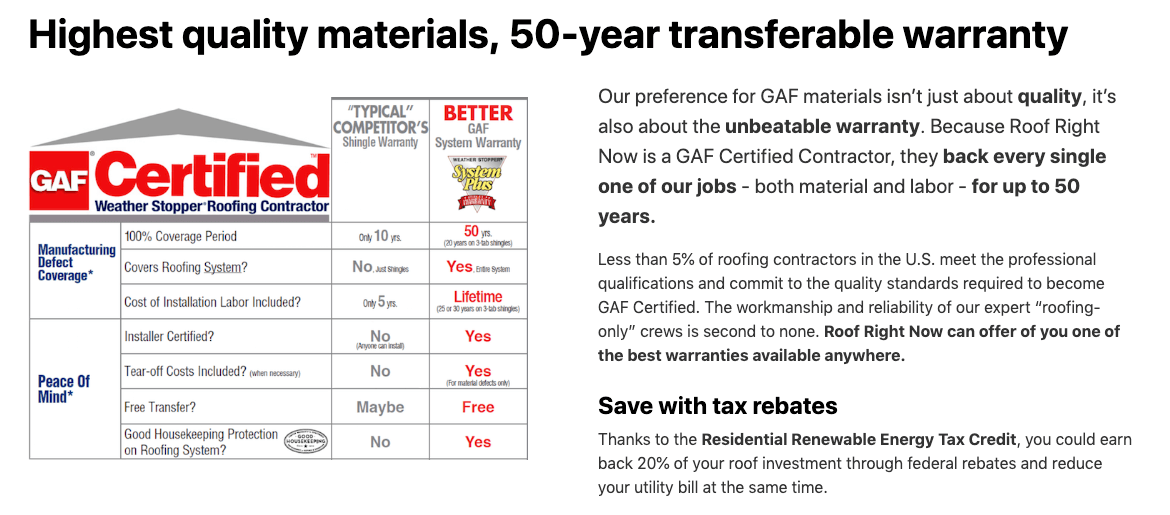
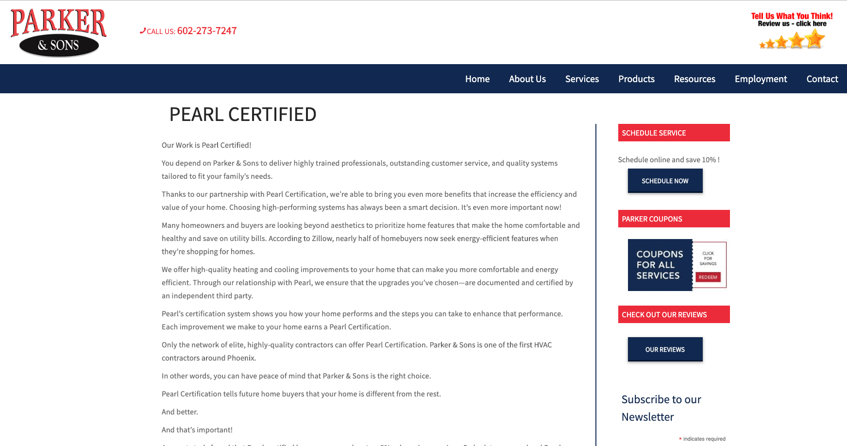
Parker & Sons is transparent about the training and expectations it sets for the crew that will show up at your home. It also dedicates an entire site page to break down its quality certification.
Whatever your detailed quality assurance is, make sure site visitors can access it easily and quickly so they know your work is more than just your work and has been assessed and certified by third party agencies and companies.
As you tend to your company site now and in the future, remember people get their impression of you very quickly online and they expect your site to look and behave like their favorite, top-tier sites. Simple, easy, and clear should be the three words you try to check off when going through any single one of your pages. No exceptions.